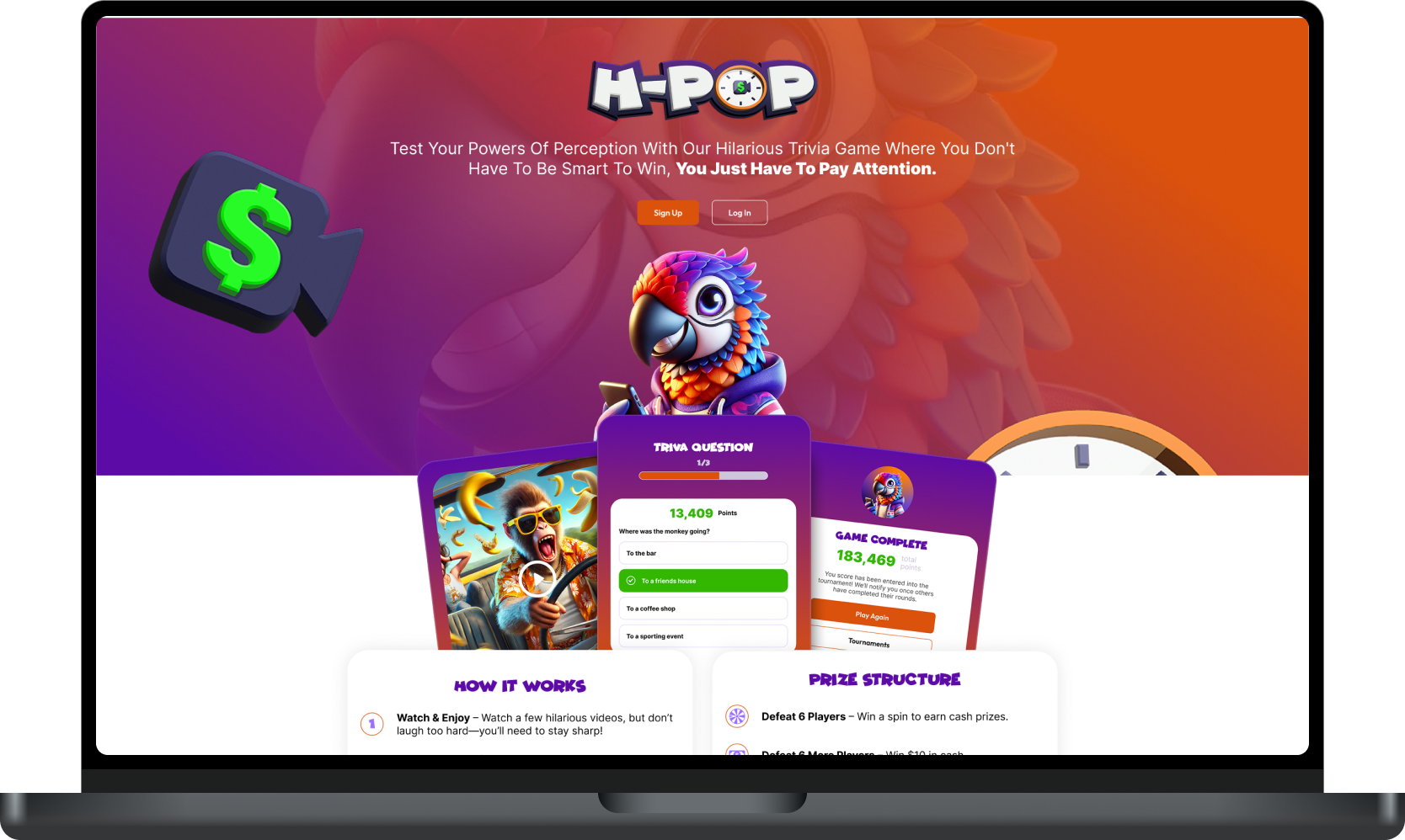
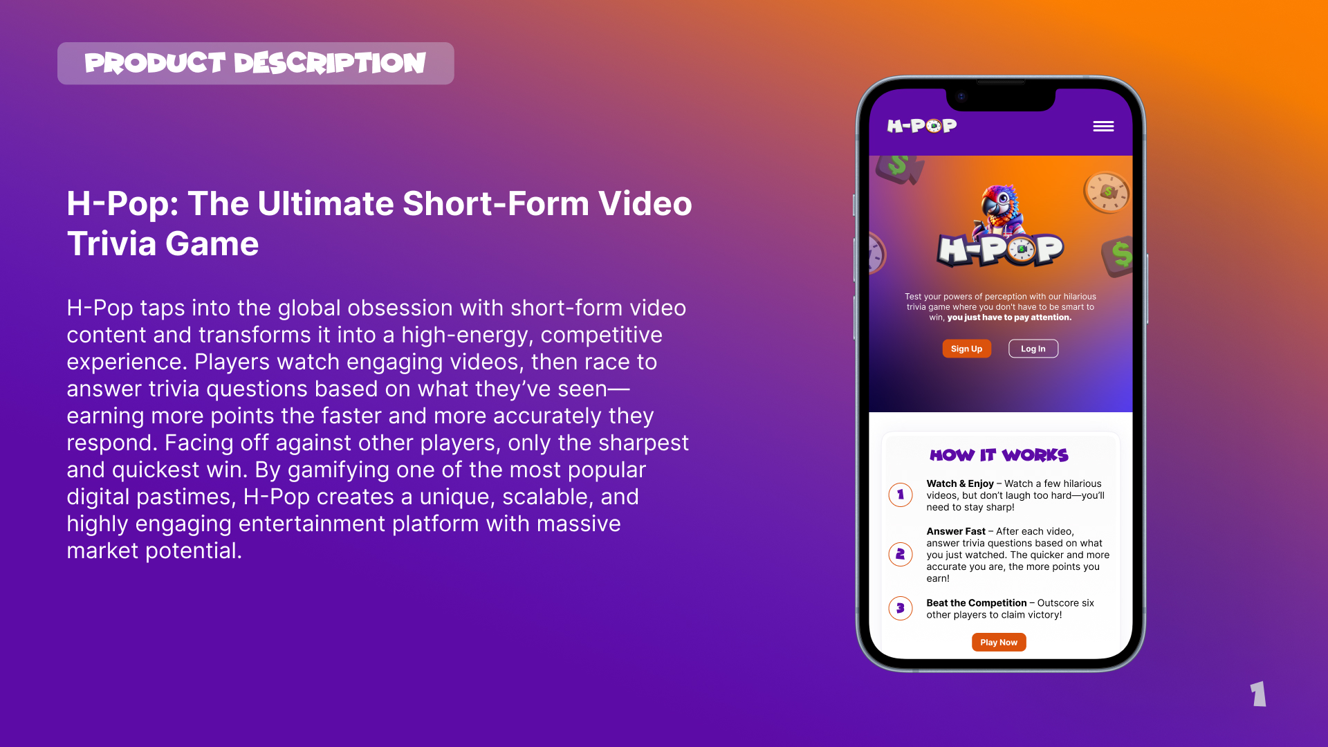
Goal
The goal with H-Pop was to elevate its video-based trivia game into a polished, engaging digital product. I led a full redesign that sharpened the user experience, modernized the visual identity, and brought clarity to core gameplay. The result was a vibrant, user-friendly interface that captured the game’s energy and made its potential instantly clear.

Branding
H-Pop’s branding was revitalized with a refreshed logo, new mascot, updated color palette, and type kit—all within a short timeframe. These enhancements elevated the game’s visual identity, making it more engaging and appealing.
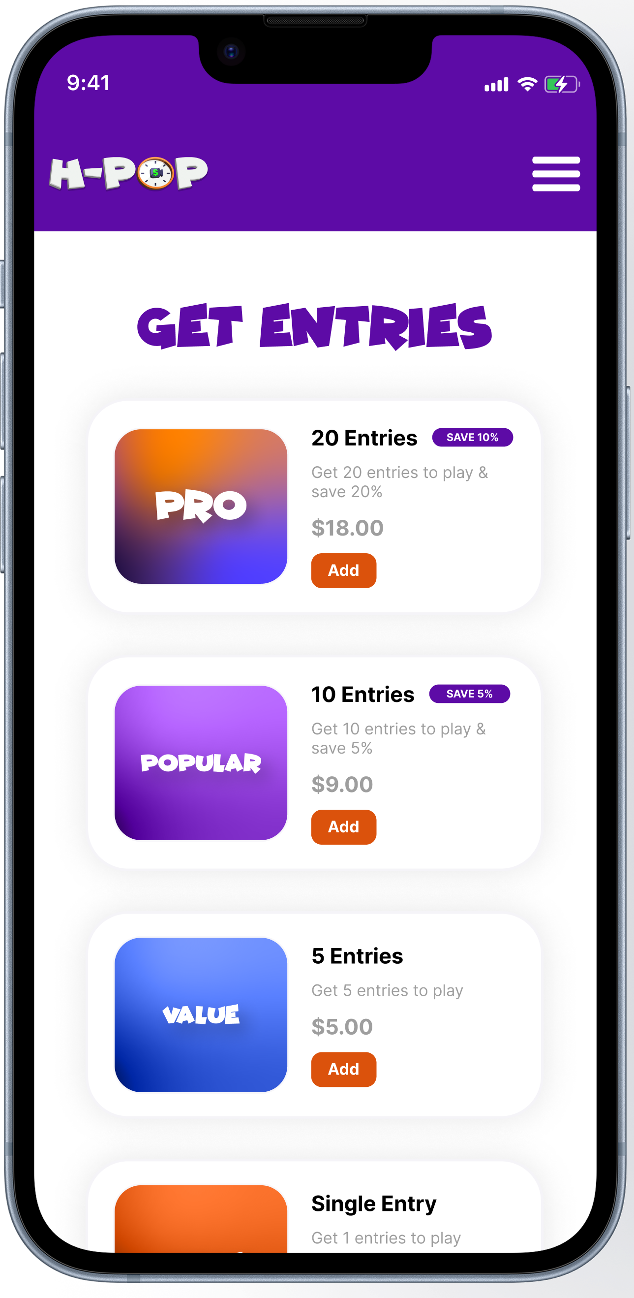
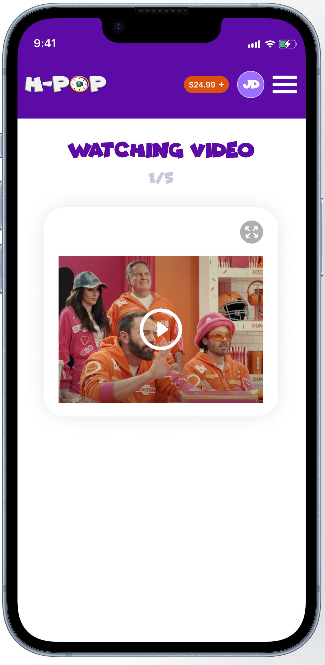
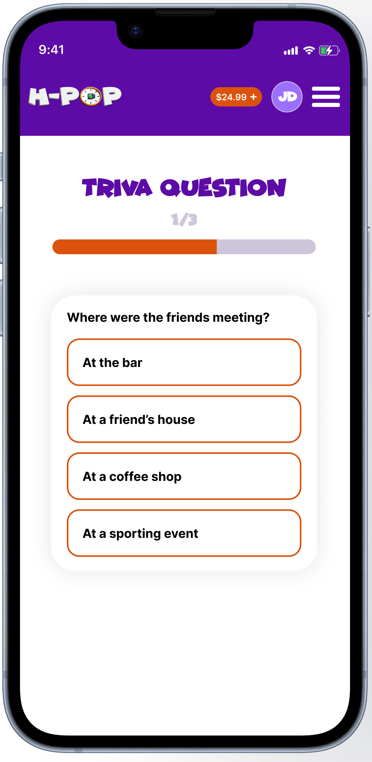
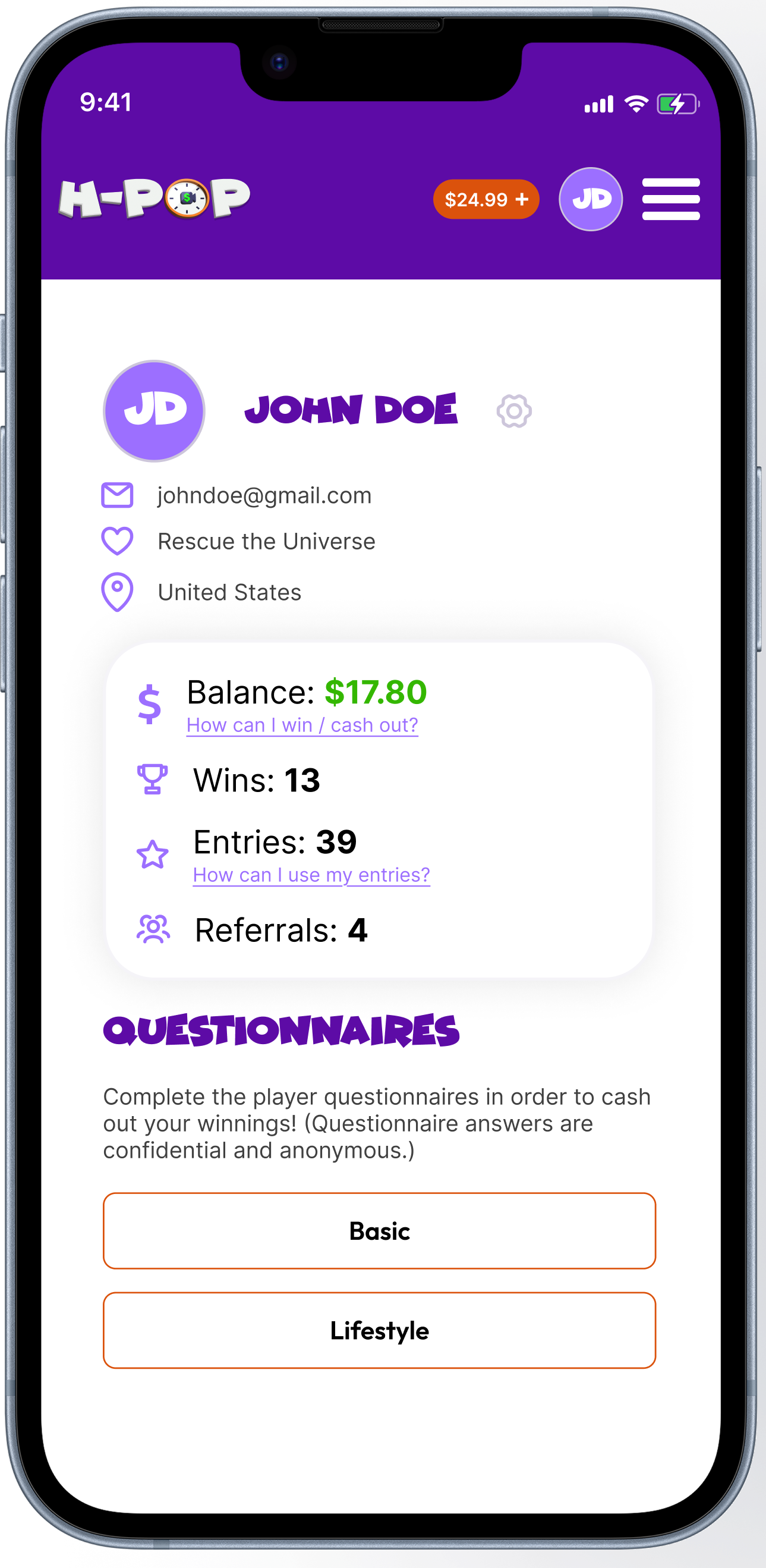
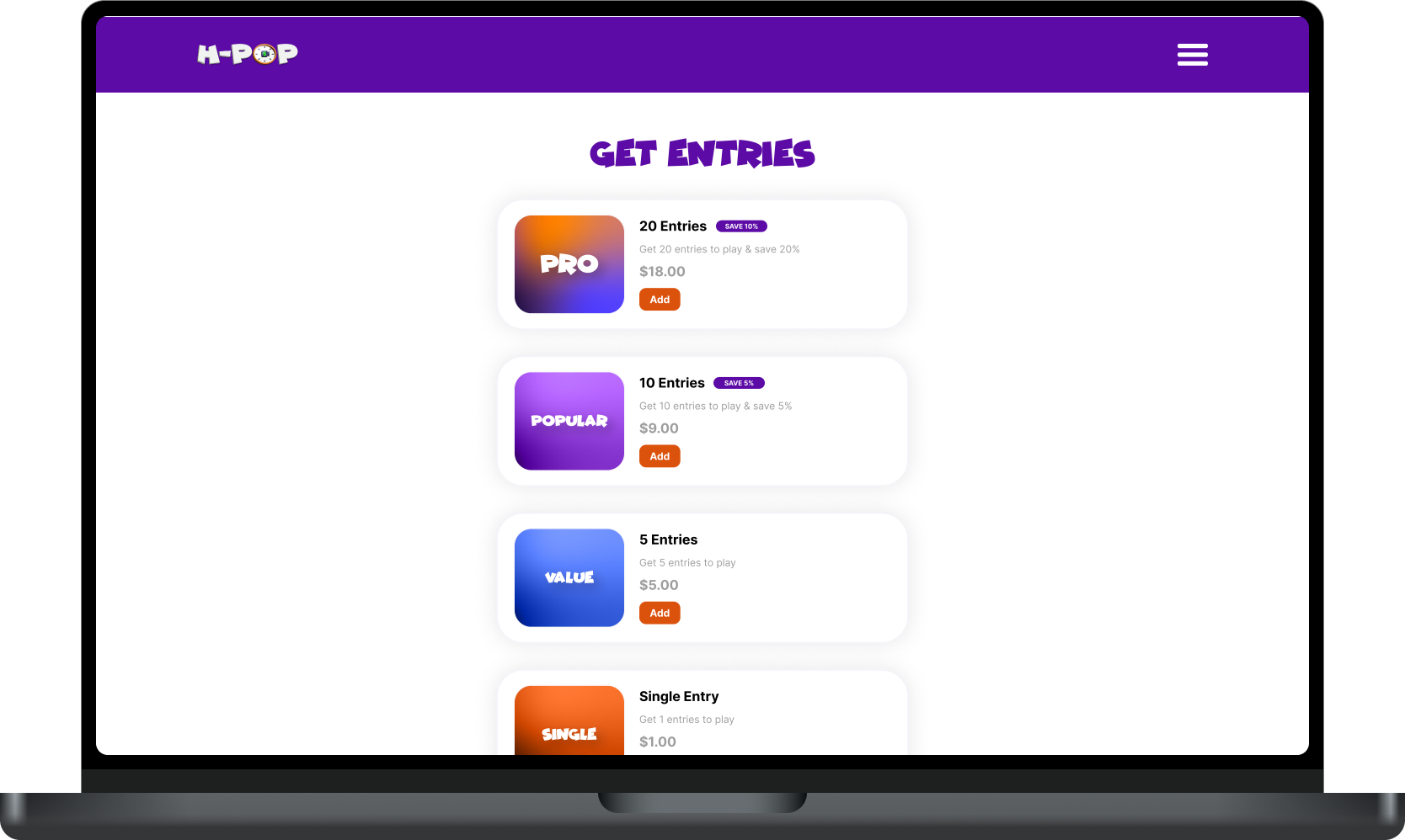
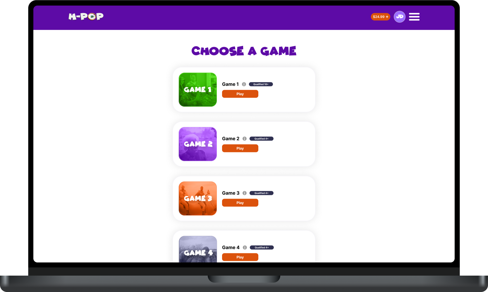
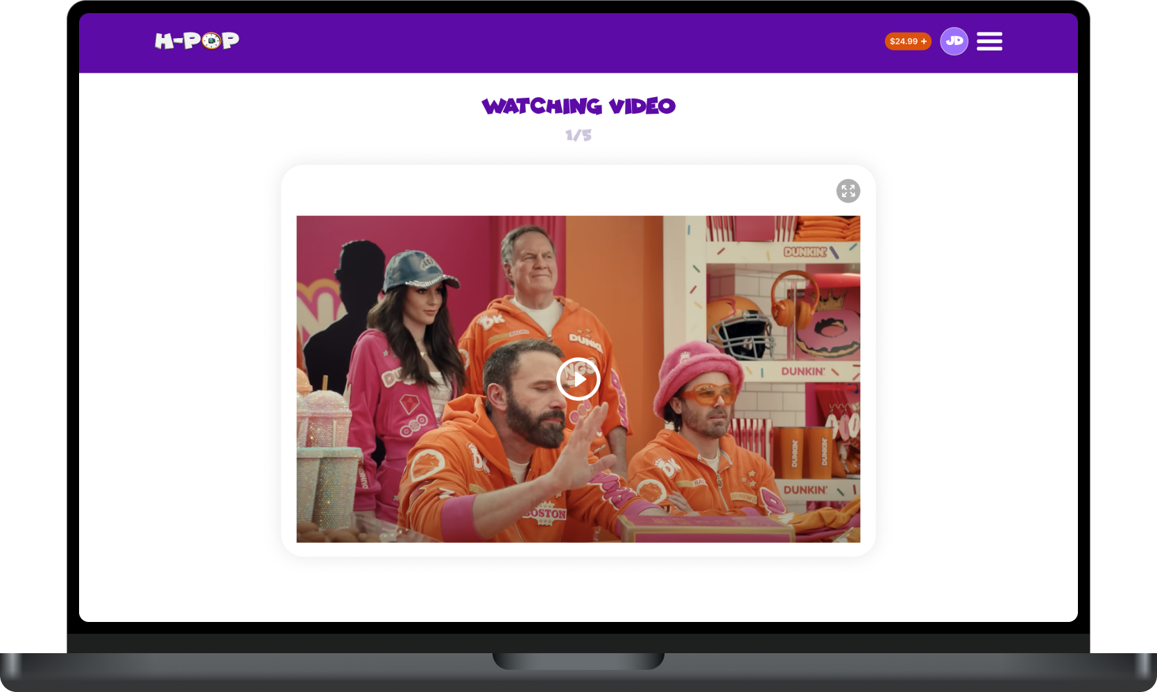
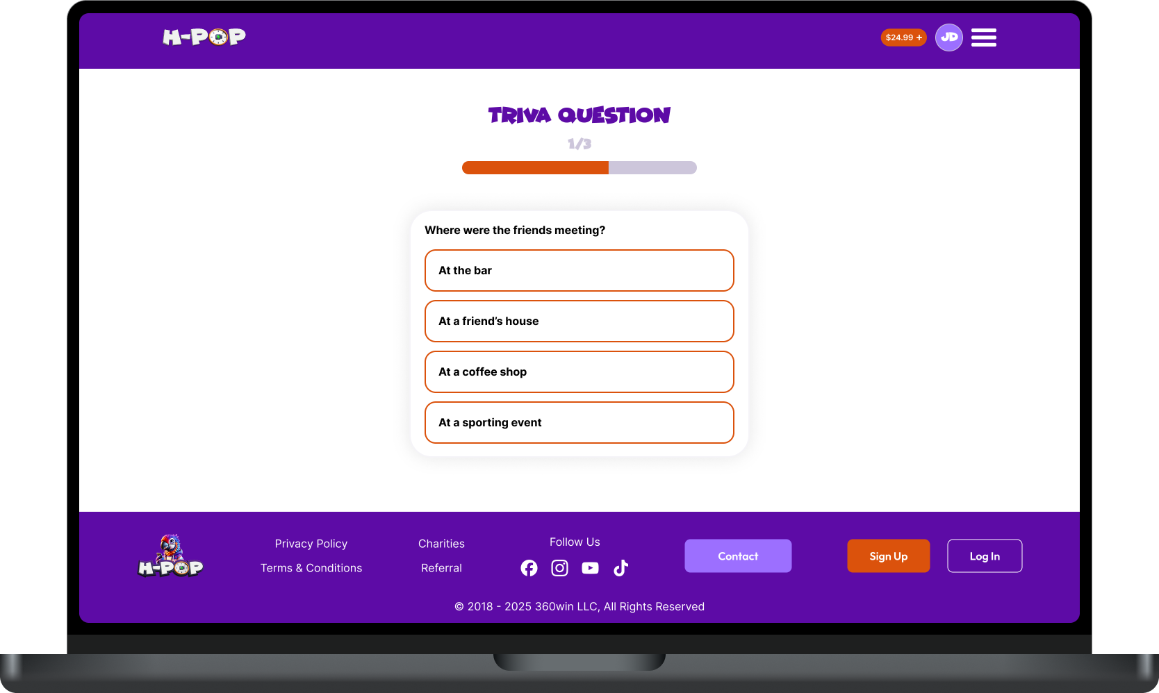
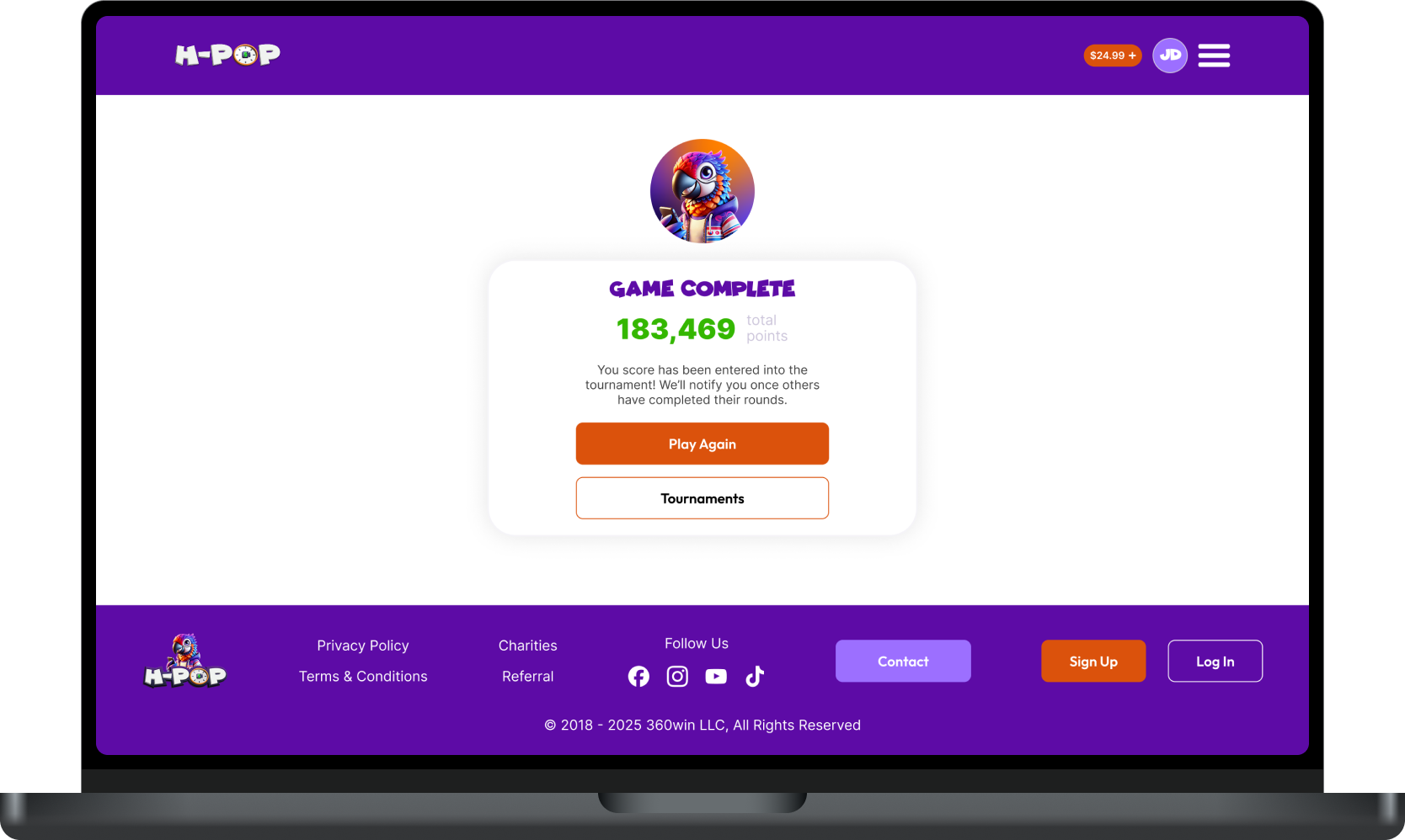
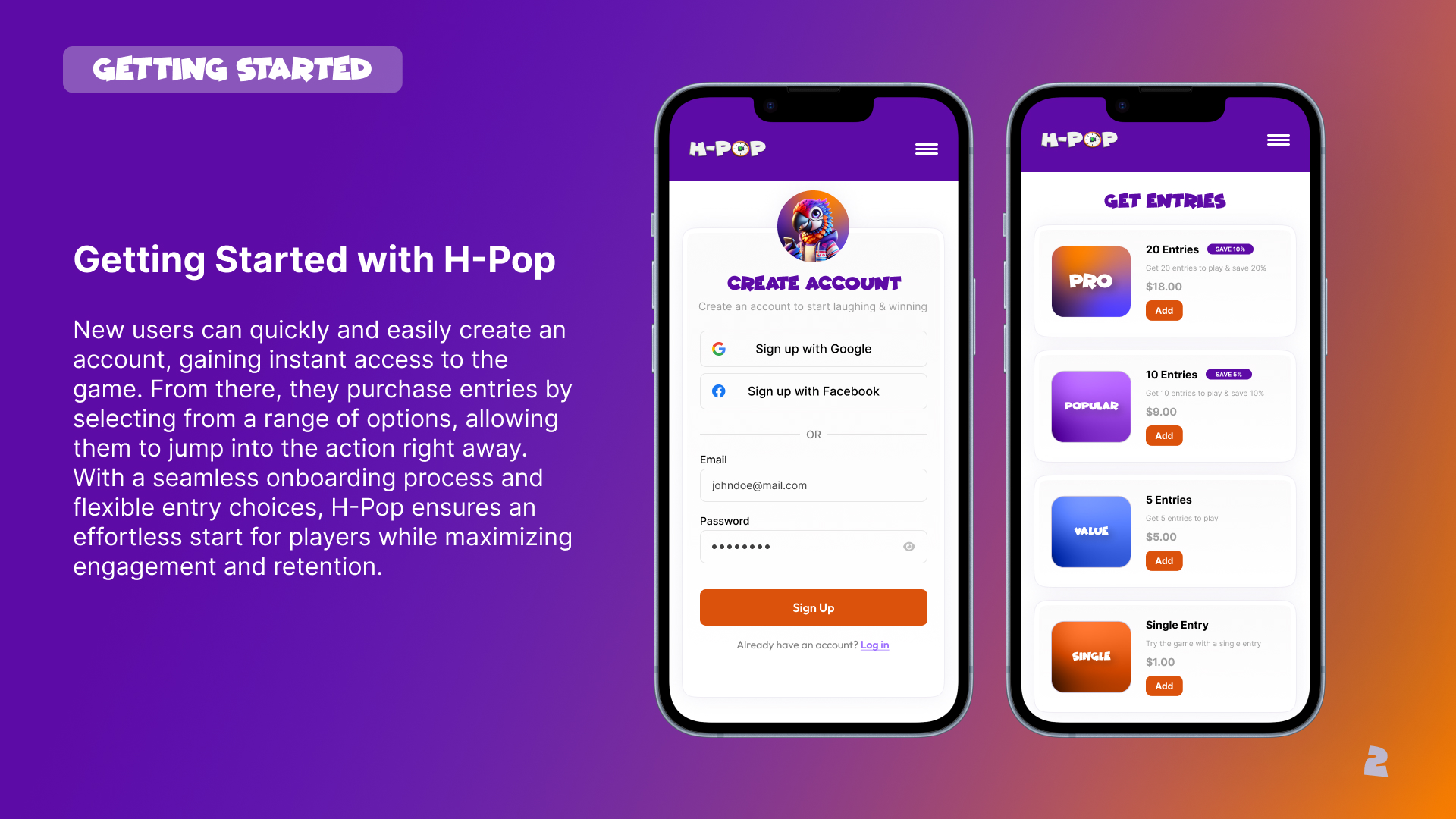
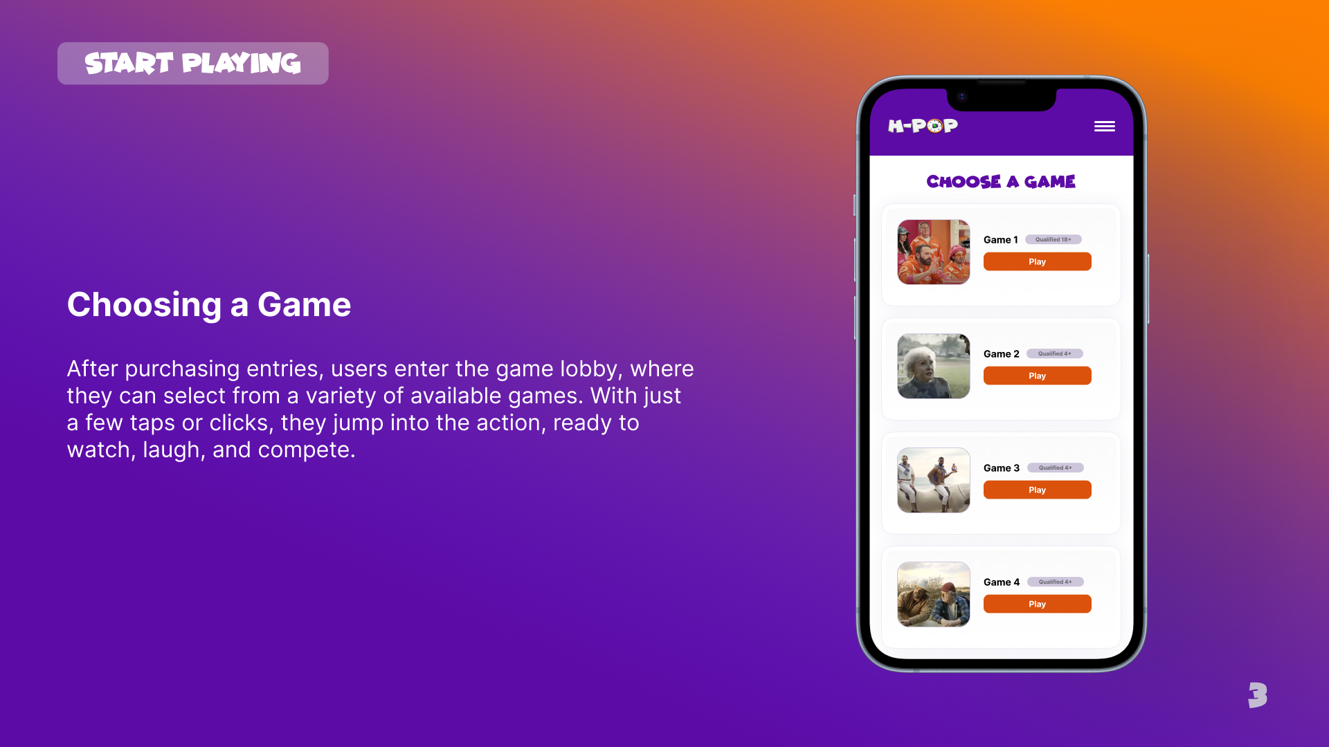
Product Redesign
H-Pop’s product was redesigned with a focus on simplicity and fun, ensuring an intuitive and engaging experience. The new design captured the excitement of the game while making it easy for users to understand and enjoy.